

A professional's website doesn't just need to look “nice” — it needs to spark a conversation. Four things are non-negotiable, whatever your trade:
- Your work up front — portfolio, case studies, hard evidence. Not words: results.
- Speed — if it loads slowly, the “wow” moment dies before it lands.
- One clear action — a single, obvious way to get in touch or book.
- Mobile first — most people will discover you on a phone.
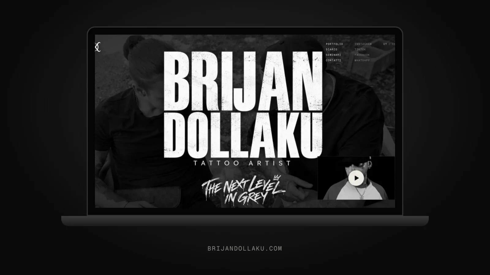
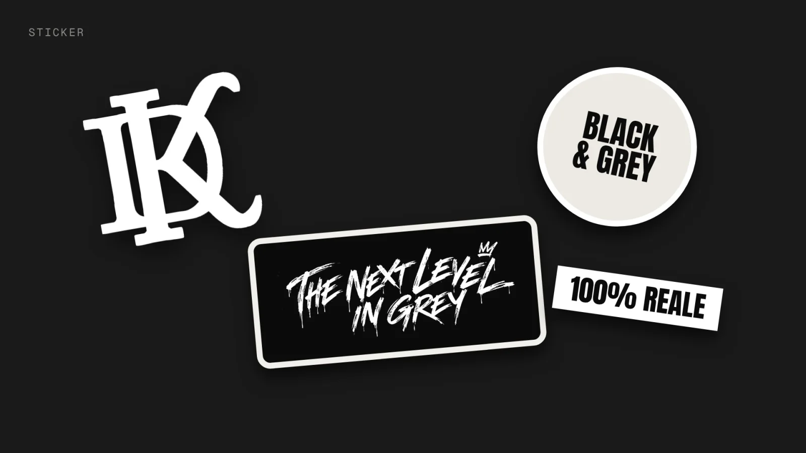
Brijan Dollaku creates hyperrealistic portraits in black & grey: tattoos that look like photographs etched into skin. Let's see how those four rules take shape in his site.
1. The work up front
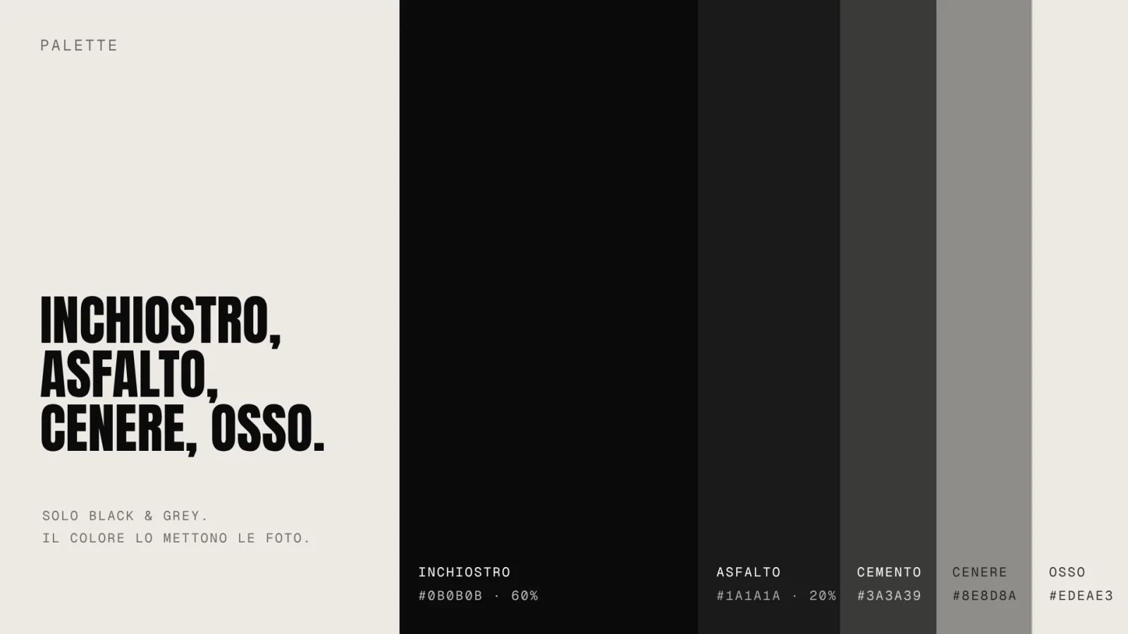
Pure black, film grain, grunge typography used sparingly. The interface is stripped to the bone: no unnecessary borders, no effects that steal the spotlight. The galleries are built so the eye goes straight to the work — the contrast between the dark background and the grey of the tattoos does everything else.
2. Speed: a design decision
A photography or tattoo site is heavy by nature: lots of high-resolution images. If they load slowly, the “wow” dies before it arrives. That's why I paid close attention to Core Web Vitals: modern formats, images served at the right size through the Next.js image component, progressive loading. The result is a site that feels as substantial as a realistic tattoo but scrolls effortlessly.
3. From “wow” to booking request
A beautiful portfolio that doesn't convert is just a catalogue. So the site guides visitors toward a single action: requesting an appointment. A simple, mobile-first form, designed for people who discover Brijan on their phone while scrolling. No pricing, no promises on wait times — just the right contact at the right moment.
4. The private area that never misses a lead
Behind the scenes there's a small private dashboard where Brijan sees incoming requests in real time, powered by Supabase's realtime features. No messages buried in a notification flood: every request comes in with full context, and he replies whenever he wants. That's the difference between a showcase site and a tool that actually works.
There's the full Brijan project with all the screens, or browse the other work in the Lab.
See the Brijan project